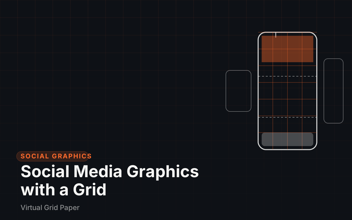
Scroll any feed and the accounts that stand out are rarely the ones with the flashiest individual posts — they are the ones where every post visibly belongs to the same set. This guide shows how to build that consistency deliberately: the canvas sizes to design at, the safe areas that keep content clear of platform interfaces, a repeatable template grid, typography and export rules, and a batch workflow that makes the next post a fill-in-the-blanks job. The structure underneath comes straight from layout fundamentals, so the coverage of grid systems in graphic design pairs well with this article if the theory is needed.
Consistency is the actual goal
A social feed is a scroll of images that get maybe a second of attention each. In that window, recognition comes from repeated signals — the same margins, the same type placement, the same palette — long before anyone reads a word. An account where every graphic is a fresh invention forces viewers to re-identify it every time; an account with a locked template gets recognized instantly and for free.
Consistency also changes the economics of production. With a template, each new graphic is mostly assembly: swap the photo, update the headline, export. Without one, every post restarts the layout conversation from zero. Across dozens of posts, that difference compounds into whether a content schedule is sustainable or exhausting.
Platform canvas sizes
Designing at the platform’s native size avoids scaling artifacts before they happen. These are the commonly recommended canvas sizes as of late 2026:
| Format | Canvas size | Ratio |
|---|---|---|
| Instagram feed (recommended) | 1080 × 1350 px | 4:5 |
| Instagram feed (square) | 1080 × 1080 px | 1:1 |
| Stories, Reels, TikTok video | 1080 × 1920 px | 9:16 |
| YouTube thumbnails | 1280 × 720 px | 16:9 |
A few supporting notes for each row:
- Instagram feed. The 4:5 portrait size is currently recommended as the best performer for feed posts because it occupies more screen than a square, but the 1:1 square remains fully standard, and widths of 1080 px support heights between 566 and 1350 px. The background on why one ratio wins feed space is in the Instagram aspect ratio guide.
- Stories and Reels. One canvas, 1080 × 1920 px, serves stories, reels, and TikTok alike. Design it once and reuse it across all three.
- YouTube thumbnails. 1280 × 720 px, under 2 MB, saved as JPG or PNG. The outer frame of a thumbnail is often what gets designed; the safe-area thinking below still helps because playback UI can sit near the edges and duration stamps can sit over the corner.
- TikTok. Same 9:16 canvas as stories, with the same overlay behavior — treat it as the same template.
Platforms update these specs occasionally, so it is worth re-checking on each platform’s own help pages before a major campaign. Broadly, social platforms display or reformat content around 4:5, 1:1, and 9:16, which is why a small set of fixed canvases covers essentially every post.
Safe areas: where the interface lives
On 9:16 full-screen content, the platform’s own interface sits on top of the design: profile names and progress bars over the top, captions, reaction buttons, and account links over the bottom. On a 1920-tall canvas, the practical guidance is to keep key content away from roughly the top 250 px and the bottom 310 px. Everything between those bands is the usable area — about 1360 px of guaranteed-visible height.
The way to honor a safe area mechanically is to make it part of the grid rather than a mental note. Extend the 9:16 canvas, divide the usable middle into rows, and treat the top forbidden band and bottom forbidden band as reserved rows that no headline, logo, or call-to-action may enter. Reserving the bands by proportion rather than pixel-counting is usually easier — an aspect ratio calculator converts the 250 px and 310 px limits into percentages directly (roughly 13% and 16% of the height, though it is more natural to grid them as fixed rows). Then the check becomes structural: content touching those bands is wrong the same way content crossing a margin is wrong.
Common Mistake Designing to the full 9:16 canvas without safe areas, then watching platform UI eat your headline.
Building the template grid
With canvas and safe areas fixed, the template itself is four decisions. The column logic here extends the approach in the design grid layout guide, adapted to vertical formats.
- Margins. Around 80 px on each side of a 1080-wide canvas works well; it leaves 920 px of content width and is large enough to survive compression artifacts at the frame edges.
- Columns. Three or four columns over the 920 px content area. With four columns and 24 px gutters, each column comes out about 212 px wide — a comfortable width for either a photo slice or a text block.
- Header zone. The band just below the top safe edge is where the hook or title sits on every post, always starting on the same column line.
- Footer/CTA zone. The band just above the bottom safe edge holds the recurring elements — handle, call-to-action chip, or serial element — in the same place every time.
Then lock the visual system so the template generates recognition:
- Two fonts maximum — one for headlines, one for support. For the specific fonts Instagram’s own tools use, see the guide to fonts used in Instagram stories.
- A fixed type scale. Typical practice is a small set of step sizes (for instance 28 / 40 / 64 px on a 1080-wide canvas) applied without exception, so headlines never silently drift between posts.
- One palette. A small fixed set of background, text, and accent colors reused everywhere. When every decision is pre-made, social media graphics stop being redesigns and become assembly.
Key Takeaway One locked template — same margins, type scale, palette — beats redesigning from scratch for every post.
A working walkthrough with the tools
The same template can be built and exercised entirely in a browser:
- Set the canvas. Start at the Instagram post ratio page to confirm feed dimensions, or jump straight to a 1080 × 1920 frame for full-screen posts.
- Grid the reference material. For collage-style posts, the Instagram story maker and Instagram story grid tools place content on a grid so posts compose predictably; this doubles as the fastest way to test whether four columns or three suits the content.
- Keep type consistent. Settle headline and support treatments once with the Instagram story font tool, then save those settings as part of the template.
- Grow the feed as a system. Treat the profile itself as a larger grid — how individual posts tile together is covered in the Instagram grid layout ideas guide.
After the first post, save everything that does not change — margins, columns, type colors, zone positions — as the template file. Every subsequent post edits only what does change.
Export settings that protect the work
A good export preserves the design; a bad one undoes it. Two rules cover most cases:
- Match the format to the content. PNG for graphics with text, logos, or flat color because it keeps edges sharp; JPG for photographic images because it is smaller. The reasoning in vector versus raster graphics explains exactly why text-heavy work degrades under lossy compression.
- Export at native pixel size. If the canvas is 1080 × 1350 px, export 1080 × 1350 px and let the platform handle any display scaling. Upscaling or odd sizes just hand the platform a reason to re-compress.
The same discipline applies to any canvas-based tool: the guide on exporting online graph paper drawings covers getting clean PNG, SVG, and PDF files out of an online grid canvas, and the same habits transfer.
Batch workflow and the consistency checklist
Batching is where a template earns its keep. Set aside one session, produce a week of posts in it, and move through each in the same sequence: open the template, save a copy under a dated, numbered name such as 2026-10-post-14.templ, swap the image, edit only the headline text, export. The naming version of the file matters as much as the design — a folder of final_final2 files destroys the efficiency the template created.
Before exporting each post, run a short check:
- Correct canvas for the destination platform?
- Margins untouched — 80 px sides, or whatever was locked?
- Headline inside the top safe band, CTA inside the bottom band?
- Only the two approved fonts, at approved scale steps?
- Exported at native pixel size in the right format?
Five checks, fifteen seconds, and the feed keeps looking like one publication instead of a pile of one-offs. Both the grid thinking and a broader grounding in the design fundamentals behind it come from the beginner’s guide to visual design, which covers the other half of the craft.
Wrap-up: lock the template, then just fill it
Consistency on social media is not a personality trait; it is a file that gets reused. Choose the correct canvas for each platform, respect the safe areas on 9:16 content, build one grid with fixed margins and type rules, export at native size in the right format, and let naming conventions keep the archive orderly. Do the setup once and every future post gets faster, more recognizable, and easier to delegate.