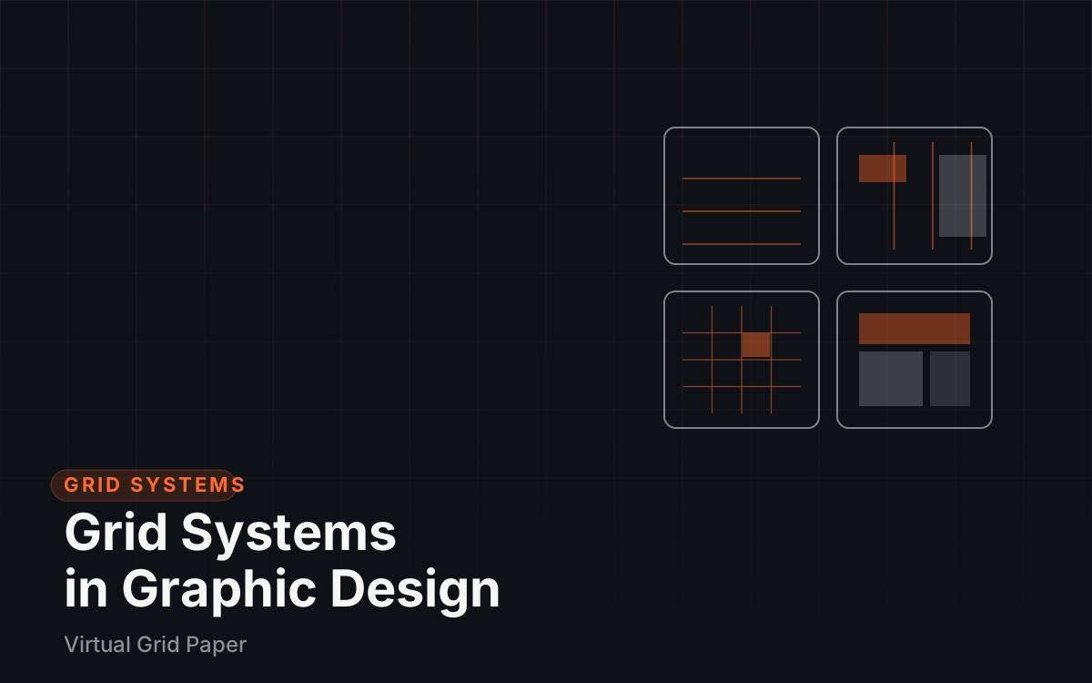
A grid system is the invisible structure underneath a page: margins, columns, gutters, and rows that position content before any styling begins. This guide defines the anatomy every grid shares, explains the four classic systems — manuscript, column, modular, and hierarchical — with example layouts for each, and lists the rules and mistakes that separate professional layouts from improvised ones. It closes with a practical way to build and rehearse a grid on paper or on screen.
What a grid system is, and why modern layout depends on one
A grid system in graphic design is an underlying structure of columns, rows, margins, and spacing used to place every element on a page or canvas. Nothing about it appears in the finished work — only its results do, as consistent margins, parallel edges, and even spacing.
Four benefits explain its dominance. Consistency: pages in a book, screens in an app, or issues of a magazine hold together. Alignment: every element sits on a defined line instead of an eyeballed one. Speed: positions are decided by the system, so a layout requires a few large decisions rather than many small ones. Collaboration: when several people work on one project, the grid is the shared rulebook they all follow. The approach was popularized in the mid-20th century by Swiss and International Typographic Style designers, who built identities, publications, and exhibitions on strict systematic grids, and layout work in both print and web has built on the idea ever since.
Common Mistake Confusing the grid with a visible table. Column lines are never shown in the final piece; only their effects — clean alignment and even spacing — appear.
The anatomy every grid shares
Grids differ in arrangement, but the vocabulary is constant, and four terms cover most of it.
Margins
Margins frame the content area on all sides, absorbing the space between the edge of the format and the work itself. Generous margins keep dense content legible in print, and they protect elements from trimming lines and screen bezels.
Columns and gutters
Columns are the vertical divisions where content flows, and gutters are the fixed gaps between them. Column count sets the granularity of layout decisions: more columns allow finer and more varied block widths, while fewer columns force larger, simpler decisions.
Flowlines and baselines
Flowlines are horizontal lines that break the columns into rows and give elements a shared line to sit on. A baseline grid is the stricter typographic version: every line of text sits on an invisible repeating baseline, so paragraphs in different columns align with each other.
Modules and spatial zones
Where columns meet the rows between flowlines, the intersections form modules — the small rectangular units of a modular grid. Spatial zones then group modules into larger areas assigned to specific jobs, such as a zone reserved for images and another for captions.
The manuscript grid: one block, built for reading
The manuscript grid is the simplest system: a single continuous block of content bounded by margins, deciding little beyond where the text begins and ends. It is the natural structure of books, essays, and long-form articles, where reading continuity matters more than arrangement variety.
An article page is the standard example — a headline opens the block, body text runs within the margins, and inline figures interrupt the flow without leaving it. Variations add a sidebar or footnote column beside the main block, but the defining feature remains one dominant reading area. Choose it whenever the content is primarily text and the layout’s job is to keep reading comfortable over longer stretches.
The column grid: the workhorse of posters and web pages
The column grid splits the content area into two or more vertical columns, and content may occupy one column or stretch across several. It is the most widely used system because it handles varied content well: a poster can hold a headline across all three columns, a photograph across two, and a details block in one, all aligned to the same structure.
Web pages default to this logic for the same reasons. A common desktop pattern divides a canvas of around 1440 pixels into 12 columns, which splits cleanly into halves, thirds, and quarters as different sections demand. A three-column poster and a 12-column dashboard share one underlying idea; only the density differs. Column count is picked by content density rather than by fashion, a point covered in the rules below.
The modular grid: columns plus rows become cells
The modular grid adds flowlines to a column grid, subdividing the content area into equal rectangular cells. It suits any layout that repeats similar-sized content: magazine pages arrange articles and images in modules, dashboards align cards in modules, photo mosaics and gallery walls are modular by definition, and a social media feed is a one-column modular rhythm.
The strength of the system is rhythm with flexibility: a design can merge modules horizontally for a wide image or vertically for a tall one, and the merged block still lands back on the structure. The cost is rigidity — content that does not fit the cell proportion fights the grid instead of flowing within it, so modular grids work best when the content set is predictable.
The hierarchical grid: structure follows content priority
The hierarchical grid drops uniform division: rows and columns are irregular, sized by the priority of the content itself. An editorial homepage is the classic case — one lead story occupies a large area, secondary stories stack in a narrower strip, and a link list fills the remainder — with intervals set by importance rather than by equal division.
The system fits news sites, campaign pages, and dashboards whose panels genuinely differ in importance. Its risk is drift: without the discipline of repeated values, hierarchical layouts slide into improvisation, so they still lean on consistent margins, set spacing steps, and a few shared widths to stay coherent.
Rules that survive contact with real projects
A handful of practices hold up across all four systems:
- Start from the margins. Fix the frame first; columns and everything else fill what remains. Margins decided last produce cramped layouts.
- Match column count to content density. A dense dashboard justifies 12 columns; a photo poster often needs three. Column count is an information decision, not a stylistic one.
- Align everything to something. Every element should relate to a column edge, a flowline, or an explicit center. An element aligned to nothing reads as an error.
- Prefer considered asymmetry. A two-thirds, one-third split beats a perfectly even split in most layouts, because uneven proportions carry hierarchy.
- Treat whitespace as structure. The areas without content are part of the system; empty columns and generous gutters do as much compositional work as the filled ones.
Deliberately breaking the grid is also a valid move — a single element crossing columns or rotated off-axis becomes an emphasis precisely because everything else respects the structure. The key word is deliberately: a break is a decision, never an accident.
Key Takeaway A grid is a constraint that buys speed: with columns and margins already decided, a layout makes a few large choices instead of many arbitrary ones.
Common mistakes that ungrid a layout
Several failures show up repeatedly in beginner and rushed layouts alike:
- Equal-width content in every column. When every block mirrors its neighbors, the grid produces monotony instead of order. Vary how many columns each block spans.
- Ignoring the gutters. Letting content press across the gaps visually merges separate items. Gutters exist to separate.
- A grid denser than the content. More columns or modules than the content can fill leaves a page fussy and fragmented.
- Centering everything. When every element aims at the page center, the alignment structure disappears and the eye loses its fixed edges.
- Breaking the grid accidentally. One element a few pixels off the shared edge reads as a mistake, while a deliberate, larger break reads as intent.
- Filling leftover whitespace with ornaments. Small decorations dropped into whatever gaps remain trade the calm of the grid for clutter.
Build a real grid and rehearse the layout
The fastest way to absorb grid systems is to build one and place content in it, at low stakes, more than once. On paper, printable graph paper can be set to a chosen spacing so it acts as a printed modular grid: sketch two alternative layouts per sheet, note where each block lands, and compare margin and whitespace handling. For a finer ruled base, the difference between graph paper and grid paper explains which paper suits which exercise, and specialized ruled sheets serve dimensional drawing — a guide to square, triangular, isometric, and perspective grids covers how those support perspective and form studies.
On screen, the grid generator places custom columns, gutters, and margins over any canvas size, so a layout can be planned against the same measurements the final design will use. From there, designing a grid for better graphic layouts applies a system to real graphic projects, a consistent grid approach for social media graphics extends one grid across a series of posts, and the beginner’s guide to visual design situates grids among the wider principles — contrast, hierarchy, typography, and color — that operate on top of structure.
Choose the grid before the content
Layout decisions become far cheaper when the structure is picked first: select the system that matches the content’s priority, fix the margins, and let the columns and rows organize placement. Rehearse the structure on paper or with a generator before committing to styling, and treat every departure from it as a deliberate emphasis. Layouts built this way look calmer and are produced faster than arrangements improvised element by element.