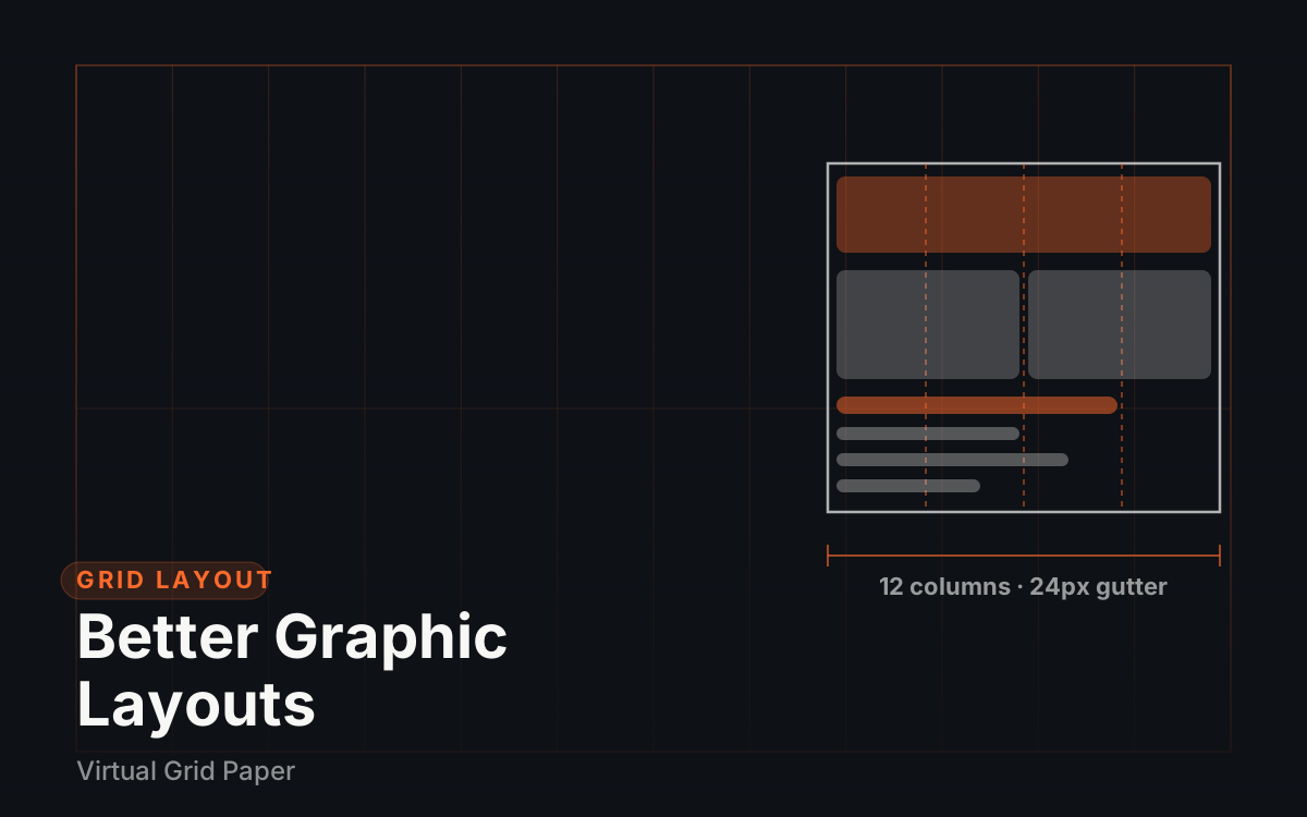
A design grid is the invisible scaffolding that sits underneath a layout: fixed margins at the edges, a set number of columns in the middle, and consistent gutters between them. This guide shows how to choose a grid for a real canvas, apply it to posters and social media graphics, and practice the discipline with printable and on-screen grid tools. The aim is practical: by the end, setting up a layout should take minutes instead of repeated nudging.
Why grids make layouts better
A grid does three jobs at once. It enforces consistency, because every element starts and ends on a shared line. It creates rhythm, because repeated column widths and gutters give the eye a predictable beat to follow down the page. And it speeds up decisions, because “where does this go?” stops being an open-ended question and becomes “which column does it span?”.
There is a fourth, easily missed benefit: grids make collaboration predictable. When two people work on the same layout — or one person revisits their own work a week later — the grid is a shared vocabulary. “Pull the headline back to column two” means exactly the same thing to everyone involved.
Key Takeaway Margins protect the edge, gutters protect the rhythm: pick each once and never eyeball them again.
Two sentences of anatomy
Columns are vertical divisions that content spans; margins are the fixed space at the canvas edges; gutters are the fixed space between columns. If the deeper theory — modular grids, baseline grids, hierarchical systems — is what is needed, the full guide to grid systems in graphic design covers it; this article stays hands-on.
Choosing a grid: canvas, margins, columns, gutters
Start from the canvas size
Decide the destination before the arrangement. A grid built for an A4 poster will not survive being reused on a 1080-pixel-wide social post, and vice versa. Canvas size fixes where content can begin and end, so it is the first decision, not the last.
Set the margins first
Margins are measured inward from the canvas edge, and one consistent value per side is what keeps a layout from feeling either cramped or loose. Worked example: a 1080 × 1350 px social post with 80 px margins leaves 920 px of content width and 1190 px of content height.
Does 920 divide evenly by four columns? No — and that is fine. With four columns and 24 px gutters, three gutters take 72 px, leaving 848 px for columns, or 212 px each. Clean columns are pleasant, but consistent margins and gutters matter far more than round numbers. Do the math once, note the values, and reuse them.
Pick the columns
Columns should match how many distinct things sit side by side. Text blocks, images, and captions usually fit a three- or four-column grid; web pages and dense editorial layouts go higher because more columns combine into more arrangements.
For an A4 poster at 210 × 297 mm, a 12-column grid is a classic editorial choice because 12 divides evenly by 2, 3, 4, and 6, so a photo can span six columns while a caption spans two and both stay related. On a loose poster, unbundling to 6 columns with wider gutters often breathes better. Either way, mark the boundaries on paper before moving any elements.
Fix the gutters
The gutter is the spacing DNA of the layout: even a perfect column structure reads as sloppy if gutters vary. Choose one value — 24 px on the earlier social post, say, or 8–10 mm on a printed poster — and never adjust it mid-layout.
Applying the grid when designing a poster
Posters reward strict order precisely because their content is big and sparse. Work in this order:
- Define the margins. Draw the margin frame first. Nothing outside it except intentional bleeds.
- Place one dominant element. Headline, photograph, or focal graphic — let it span multiple columns, since scale across several columns is what reads as dominance.
- Add supporting text. Details, dates, credits — fill the remaining columns, never spill into gutters.
- Check the negative space. Step back and look at the empty areas. On a grid, leftover space falls into whole columns or clean halves awkwardness; if the holes look accidental, change how many columns each element spans rather than nudging positions.
That check matters more than it sounds. Empty aligned space reads as designed; empty misaligned space reads as unfinished. If the gaps look random, adjust how many columns each element spans rather than moving things by eye.
Applying the grid to social media graphics
Social formats add a constraint print does not have: the canvas ratio is fixed and, for full-screen formats, parts of the canvas are covered by interface elements. Build the grid to respect both.
Take the same 1080 × 1350 px post from earlier: 80 px side margins, 212 px columns, 24 px gutters. Place the headline across two columns, the visual across all four, and a caption strip inside a single column, and the composition essentially arranges itself. For full-screen formats such as stories, shrink the usable area first so nothing important hides behind the interface, then divide what remains — the exact canvas numbers are on the Instagram post ratio page. Keeping one grid across every platform post is the core of consistent social media graphics.
Responsive thinking without the code
The same column logic simply reflows. On a desktop width, a layout might use 12 columns; on a tablet, the same content often collapses to 4–6; on a phone, most content wants one or two columns with wider gutters. Two habits carry over unchanged: margins shrink as the canvas shrinks (an 80 px edge on a 1080-wide canvas would be enormous on a 360-wide phone screen), and column counts drop rather than columns squashing into unreadable strips. Designing each breakpoint as a fresh grid — rather than shrinking one design — is the whole idea behind a responsive grid.
Common Mistake Centering everything because the grid felt restrictive — using one alignment, not centered-only layouts, is what makes pages feel designed.
Practicing with grid tools
Fastest on-ramp: generate a custom grid — set spacing, line color, thickness, and opacity, then download it as a PNG or JPG and lay it under or beside whatever is being designed. Two other paths cover the other senses of the word “grid”:
- Printable sheets. Printable graph paper produces true-scale practice sheets, which is the quickest way to thumbnail poster layouts and column sketches by hand before touching software.
- A drawing canvas that snaps. The online drawing canvas offers square, isometric, and dot grids with shape tools and measurements; turn snapping on and elements align to the structure automatically (the mechanics are covered in the guide to snap to grid). It also exports the results, and choosing between PNG, SVG, and PDF ties directly into vector versus raster graphics.
Working by hand first is not nostalgia. Sketching column arrangements on paper exposes weak structure in seconds, and those sketches transfer directly to the screen.
Wrap-up: put the grid under everything
A graphic design grid layout is not a cage; it is a set of decisions made once so the interesting decisions get attention. Fix the canvas, lock margins and gutters to single values, choose columns to match the content, and let elements span different counts to create the rhythm. For a broader foundation before going deeper, the beginner’s guide to visual design pairs well with this workflow, and all of the practice tools live in one place on the tools page.